Week 10: Visualization!
In this week we will focus on using Jupyter and matplotlib to visualize data.
Our data this week will be drawn from the replication material of
Hall, Andrew B., Connor Huff, and Shiro Kuriwaki. 2019. “Wealth, Slaveownership, and Fighting for the Confederacy: An Empirical Study of the American Civil War.” American Political Science Review 113 (3): 658–73. https://doi.org/10.1017/S0003055419000170.
We will use their replication data and matplotlib to reproduce key figures and results from their analysis.
Their dataset is available from the Harvard Dataverse, but for simplicity we will grab the data from a Dropbox link (click "Open"$\rightarrow$"Download"). Download this version of the data, because I have made a few transformations of the data to avoid some potential headaches.
The first few cells of this notebook import some libraries and define some familiar functions (these are taken from the solutions to pr08 - dictionaries). We will be working with the replication data in a familiar list-of-dictionaries form.
# our imports - no need to change this
from statistics import mean, stdev
from math import sqrt
import matplotlib.pyplot as plt
import csv
%matplotlib inline
def load_data(filename):
    """
    Read a comma-separated dataset in from a file, and, using csv.DictReader,
    return a list of dictionaries.

    Parameters
    ----------
    filename (str): the path to the file

    Returns
    -------
    A dataset, in list-of-dicts form.
    """

    fin = open(filename, "r")
    dr = csv.DictReader(fin)
    l = [row for row in dr]
    fin.close()
    return l

def filter_numerical(dataset, key, min_value, max_value):
    """
    Filters the dataset by a numerical column and return the specified subset

    Parameters:
        dataset (list of dicts): the input data
        key (str): a dict key corresponding to a column in the data
        max/min_values (float): the minimum and maximum values to filter on

    Returns:
        filtered_data (list of dicts): the filtered data, with the same column structure as dataset
    """

    return [row for row in dataset if float(row[key]) >= min_value and float(row[key]) <= max_value]


def filter_categorical(dataset, key, categories):
    """
    Filters the dataset by a categorical column and return the specified subset

    Parameters:
        dataset (list of dicts): the input data
        key (str): a dict key corresponding to a column in the data
        categories (list): a list of strings representing categories to include

    Returns:
        filtered_data (list of dicts): the filtered data, with the same column structure as dataset
    """

    return [row for row in dataset if row[key] in categories]

def get_column(dataset, key, is_numeric):
    """
    Return a particular column from a CSV by looking up a key in a list of dicts.

    Parameters
    ----------
    data (list): a list of dictionaries representing a dataset.
    key (str): the name of the column, which will be a key in each dict.
    is_numeric (bool): if True, cast each element to float before returning.

    Returns
    -------
    A list of values corresponding to the value for key in each dict.
    """

    l = [row[key] for row in dataset]
    if is_numeric:
        l = [float(x) for x in l]
    return l
We also provide a convenience function for producing confidence intervals for a set of numeric values.
def get_conf_int(data, width=1.96):
    """
    Return 1.96 * SD/sqrt(N), i.e. 1.96 times the standard error of the data, so that
    we can construct a 95% confidence interval.

    Parameters
    ----------
    data (list): A list of numeric values.
    width (float): The width of the CI. 1.96 corresponds to 95% confidence.

    Returns
    -------
    CI (float): the distance from the mean to constuct the CI (i.e., the CI is the mean ± this value)
    """

    return width * stdev(data)/sqrt(len(data))
(1.1) Begin by loading the data. Take a couple of minutes to look through the documentation of the datasets in the provided documentation file, 00_HHK_Documentation.pdf.
households = load_data("/home/main/Dropbox/ds2001data/hall_confederacy/analysis_largeN_household.csv")
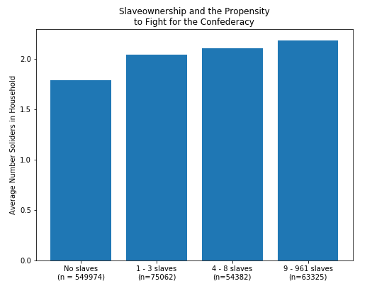
(1.2) We are going to begin by focusing on reproducing Figure 1 from the Hall et al. paper.
We want to being by making four lists of numbers, corresponding to the number of soldiers (confdr_hh_count) in the household for each group. To do this we will want to use the filter_numerical function to get, e.g., the non-slaveowning households (look at slaves_hh_count), and then the get_column function to get the number of Confederate soliders in a household.
g1 = get_column(filter_numerical(households, "slaves_hh_count", 0, 0), "confdr_hh_count", True)
g2 = get_column(filter_numerical(households, "slaves_hh_count", 1, 3), "confdr_hh_count", True)
g3 = get_column(filter_numerical(households, "slaves_hh_count", 4, 8), "confdr_hh_count", True)
g4 = get_column(filter_numerical(households, "slaves_hh_count", 9, 1000), "confdr_hh_count", True)
After making these four lists, we will want to get two numbers for each: the average number of soliders in the household and the number of households in that analysis group.
y1 = mean(g1)
y2 = mean(g2)
y3 = mean(g3)
y4 = mean(g4)

n1 = len(g1)
n2 = len(g2)
n3 = len(g3)
n4 = len(g4)
Matplotlib's barplot takes two arguments: a list of numbers corresponding to the horizontal locations of the bars (the x-axis), and a list of numbers corresponding to the heights of the bars (the y-axis). These must be the same length.
X = [1, 2, 3, 4]
Y = [y1, y2, y3, y4]
So, let's plot these X and Y values. We will use plt.subplots() to get two objects, one corresponding to the figure as a whole and another representing an axis (subplot) on which we will plot our data. The distinction between these may be unclear now but will become clearer once we have more than one plot at a time. For now focus on using just ax. For this plot, in addition to plotting the bars, we want to set the following axis attributes:
- The location of the tickmarks on the x-axis (
ax.set_xticks()) - The labels appearing under each tick mark on the x-axis (
ax.set_xticklabels()) - The y-axis label (
ax.set_ylabel()) - The subplot title (
ax.set_title())
fig, ax = plt.subplots(figsize=(8, 6))

ax.bar(X, Y)
ax.set_xticks([1, 2, 3, 4,])
ax.set_xticklabels(
    [f"No slaves\n(n = {n1})",
     f"1 - 3 slaves\n(n={n2})",
     f"4 - 8 slaves\n(n={n3})",
     f"9 - 961 slaves\n(n={n4})"])
ax.set_ylabel("Average Number Soliders in Household")
ax.set_title("Slaveownership and the Propensity\nto Fight for the Confederacy");

The figure should look something like this. (Note: the $n$s differ slightly from the published version in the paper, because I have dropped a few problematic counties from the dataset.)
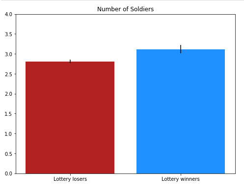
(1.3) We'll now move on to reproducing Figure 5 from the paper. First, we'll focus on reproducing only the left-hand subplot; we'll make the whole thing in 1.4. This uses a different dataset, so begin by loading the lottery data.
lottery = load_data("hall_confederacy/analysis_lottery_household.csv")
The lottery analysis in this paper treats an 1832 land lottery in Georgia as a natural experiment; we are analogizing the winners of the lottery to the people who receive a treatment in a medical trial, and the losers to those who received a placebo. For that reason, the binary (0/1) variable indicated the winner of the lottery is called treat. In this plot, we are comparing the average number of soldiers in "treated" households versus "control" households".
This time, we want to calculate the mean number of soldiers (confdr_hh_count) and the width of the 95% confidence intervals for our plot; we do not need to store the size.
g1 = get_column(filter_numerical(lottery, "treat", 0, 0), "confdr_hh_count", True)
g2 = get_column(filter_numerical(lottery, "treat", 1, 1), "confdr_hh_count", True)

y1 = mean(g1)
y2 = mean(g2)

s1 = get_conf_int(g1)
s2 = get_conf_int(g2)
For this plot, we want to make a barplot with error bars (hint: check the documentation, in particular yerr). We also want to set the following properties:
- The location of the tickmarks on the x-axis (
ax.set_xticks()) - The labels appearing under each tick mark on the x-axis (
ax.set_xticklabels()) - The minimum and maximum y-axis values (
ax.set_ylim()) - The subplot title (
ax.set_title())
We are also going to use color to better distinguish the treatment case from the control case using the color parameter to ax.bar() (hint: check the same documentation page as before). We'll use red for the control case and blue for the treatment case; because the colors you get in matplotlib when you use 'red' or 'blue' are terrible and garish, I have defined two constants for slightly less terrible colors.
RED = "firebrick"
BLUE = "dodgerblue"

fig, ax = plt.subplots(figsize=(8, 6))

ax.bar([1, 2], [y1, y2], yerr = [s1, s2], color=[RED, BLUE])
ax.set_xticks([1, 2])
ax.set_xticklabels(["Lottery losers", "Lottery winners"])
ax.set_ylim(0, 4)
ax.set_title("Number of Soldiers");

The figure should look something like this.
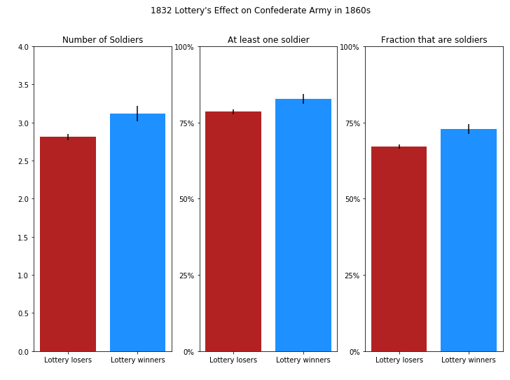
(1.5) Now we want to reproduce Figure 5 as a whole. Warning: this is going to be pretty involved.
Here, we are making subplots for each of three outcomes:
- Number of soldiers (
confdr_hh_count) - At least one soldier (1 if
confdr_hh_count > 0, else 0) - Fraction that are soldiers (
frac_confdr_count_men)
As before, we are going to include error bars and colors to distinguish treatment and control cases, and we are going to set the following properties:
- The location of the tickmarks on the x-axis (
ax.set_xticks()) - The labels appearing under each tick mark on the x-axis (
ax.set_xticklabels()) - The minimum and maximum y-axis values (
ax.set_ylim()) - The subplot title (
ax.set_title())
We are also going to set two new properties for the second and third subplots:
- The location of the tickmarks on the yaxis (
ax.set_yticks()) - The labels appearing by each tick mark on the y-axis (
ax.set_yticklabels())
fig, (ax1, ax2, ax3) = plt.subplots(ncols=3, figsize=(12, 8))

g1 = get_column(filter_numerical(lottery, "treat", 0, 0), "confdr_hh_count", True)
g2 = get_column(filter_numerical(lottery, "treat", 1, 1), "confdr_hh_count", True)

y1 = mean(g1)
y2 = mean(g2)

s1 = get_conf_int(g1)
s2 = get_conf_int(g2)


ax1.bar([1, 2], [y1, y2],
        yerr = [s1, s2],
        color = [RED, BLUE])
ax1.set_xticks([1, 2])
ax1.set_xticklabels(["Lottery losers", "Lottery winners"])
ax1.set_title("Number of Soldiers")
ax1.set_ylim(0, 4)

g1 = [int(x > 0) for x in g1]
g2 = [int(x > 0) for x in g2]

y1 = mean(g1)
y2 = mean(g2)

s1 = get_conf_int(g1)
s2 = get_conf_int(g2)


ax2.bar([1, 2], [y1, y2],
        yerr = [s1, s2],
        color=[RED, BLUE])
ax2.set_title("At least one soldier")
ax2.set_ylim(0, 1)
ax2.set_yticks([0, 0.25, 0.5, 0.75, 1.0])
ax2.set_yticklabels(['0%', '25%', '50%', '75%' ,'100%'])
ax2.set_xticks([1, 2])
ax2.set_xticklabels(["Lottery losers", "Lottery winners"])

g1 = get_column(filter_numerical(lottery, "treat", 0, 0), "frac_confdr_count_men", True)
g2 = get_column(filter_numerical(lottery, "treat", 1, 1), "frac_confdr_count_men", True)

y1 = mean(g1)
y2 = mean(g2)

s1 = get_conf_int(g1)
s2 = get_conf_int(g2)

ax3.bar([1, 2], [y1, y2],
        yerr = [s1, s2],
        color=[RED, BLUE])
ax3.set_title("Fraction that are soldiers")
ax3.set_ylim(0, 1)
ax3.set_yticks([0, 0.25, 0.5, 0.75, 1.0])
ax3.set_yticklabels(['0%', '25%', '50%', '75%' ,'100%'])
ax3.set_xticks([1, 2])
ax3.set_xticklabels(["Lottery losers", "Lottery winners"])
fig.suptitle("1832 Lottery's Effect on Confederate Army in 1860s");

The final result should look something like this.
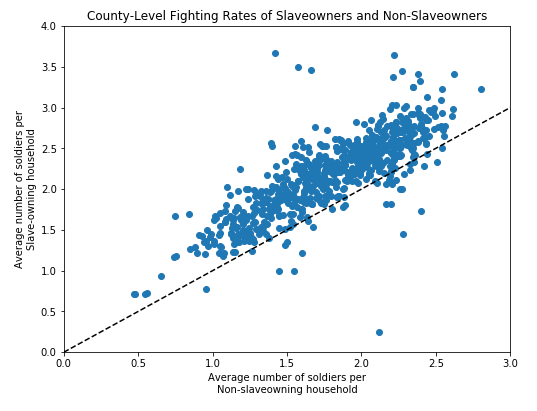
(2.1) Time permitting, we would also like to reproduce Figure 6. Instead of a bar plot, this is a scatter plot, but the logic is pretty similar.
The challenge, however, is that we need to break aggregate households to the county level. To do that, we've prodivded a groupby function; try to understand what it does, then use this to reproduce Figure 6.
Set the following properties:
- title
- xlim
- xlabel
- ylim
- ylabel
Hint: This is a fairly long calculation. Get the county-level datasets, then iterate through them, perform the calculations, and append the appropriate X and Y values to lists rather than trying to do it all in a single function call or list comprehension.
def groupby(dataset, key):
    """
    Group a dataset based on the values associated with a given key.

    For example, grouping the households dataset by the key 'state' produces
    a dictionary of datasets (list-of-dicts) where the keys are each state:

    >>> groupby(households, 'state')
    {
    'Virginia': [{'state': 'Virginia': 'county': 'VA-FAIRFAX' ...}, {'state': 'Virginia', 'county': 'VA-PRINCE WILLIAM', }, ...]
    'North Carolina': [{'state': 'North Carolina': 'county': 'NC-ALEXANDER' ...}, {'state': 'North Carolina', 'county': 'NC-BEAUFORT', }, ...]
    ...
    }

    Parameters
    ----------
    dataset (list of dicts): A dataset in list-of-dicts form.
    key (hashable): A key in a dictionary.

    Returns
    -------
    grouped_data: A dictionary of lists of dictionaries. Each key in grouped_data
                  is a value in dataset[key], and each value in grouped_data
                  is a list of dictionaries such that dataset[key] equals the value.
    """

    unique_values = list(set(get_column(dataset, key, False)))
    return {k: filter_categorical(dataset, key, [k]) for k in unique_values}
Xs = []
Ys = []
for county, county_data in groupby(households, "county").items():
    # for each county...
    # split the county dataset into slave and nonslave households
    slave_households = filter_numerical(county_data, "slaves_hh_count", 1, 1000)
    nonslave_households = filter_numerical(county_data, "slaves_hh_count", 0, 0)

    # get the average number of soliders per slave and non-slave household.
    Xs.append(mean(get_column(nonslave_households, "confdr_hh_count", True)))
    Ys.append(mean(get_column(slave_households, "confdr_hh_count", True)))
fig, ax = plt.subplots(figsize=(8, 6))
ax.plot(Xs, Ys, 'o')
ax.plot([0, 4], [0, 4], '--', color = 'black')
ax.set_xlim(0, 3)
ax.set_ylim(0, 4)
ax.set_xlabel("Average number of soldiers per\nNon-slaveowning household")
ax.set_ylabel("Average number of soldiers per\nSlave-owning household")
ax.set_title("County-Level Fighting Rates of Slaveowners and Non-Slaveowners");

The final result should look something like this.